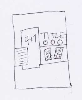
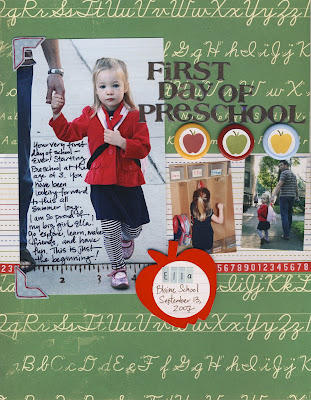
 Our sketch this week is an 8.5 x 11, but as always, can be adapted for 12x12, 8x8 and so on. We are using 3 photos. One large focal photo and two smaller accent photos. For the focal photo start with a 5x7 and trim an inch off to make a 4x7 photo. The smaller accent photos were wallet size and trimmed to 1.5x2.5. When I know I want to use a small photo on a layout I make sure NOT to crop the photo down before printing. After printing I crop the photo manually with my trimmer. That way I still get all of the main image in the finished photo. The opposite is true when I know I want to use a large photo. I do all the cropping digitally before printing. Then my image fills the entire photo without a lot of distraction.
My layout is school themed. We have a lot of great new school themed supplies at Windy City. Some of my supplies are from Maya Road which just arrived in the past few days. Susan posted a few photos yesterday.
Supplies:
Shimmer Patterned Papers by KI Memories

Green Patterned Paper by Cosmo Cricket
Chipboard Apple by Maya Road
Ruler Stamp by Maya Road
Buttons by Creative Cafe
Slick Writer by American Crafts
Micron Pen by Sakura
3/4" Circle Punch by EK Success
StazOn Ink
Glossy Accents by Ranger
Zots by ThermOWeb
Supplies from my personal collection:
Ribbon by KI Memories
Letter Stickers by Basic Grey
Photo Corner stickers by KI Memories
Journal Spot by Heidi Swapp
Letter Stickers by Making Memories
I decided to journal directly onto my photo since there was some dead space in my photo where the journaling is in the sketch. Use a Slick Writer to write directly onto your photo. The results are different and a lot of fun. I also stamped on my photo with StazOn ink to continue the line I started with the ribbon across my page.
 For the circle apple accents, I took a circle punch and punched out the little apples from my patterned paper. The 3/4" circle punch worked perfectly! There are some buttons in the Creative Cafe bulk bins that have a center of about 3/4". Just use a Zot to attach your punch outs to the button to create your own embellishments. I have to admit this is a little trick I learned from Melodee Langworthy when she taught at WCS a few months back.
For the apple I just covered the chipboard piece with some red scrap paper. Scraps are great for covering chipboard elements!
My title got a little lost in the patterned background paper. I brought a some focus to it by applying Glossy Accents to the stickers. The results are better in real life than on the scanned image. I love covering letter stickers or letter die cuts with Glossy Accents. It gives it that little something extra to finish the look.
I would love to see what you do with this weeks sketch! Post a link to your layout in the comments. Have a great weekend.


